Responsibilities
I led the research, identifying problems, ideation, prototyping, conducting usability studies, accounting for accessibility, and iterating on designs. I worked alone on the project the entire time.
The Problem
People who live busy lives don't have the time to prepare meals and waste it on confusing apps that lack clarity and essential information. Additionally, consumers with health issues miss accurate information on the ingredients, nutrient data, caloric content, and allergens.
The Goal
The food delivery app provides users with intuitive and simple-to-use functions. This app is going to make ordering food as comfortable as possible. Also understand the specific challenges that users might face during choosing meals, checkout, delivery & payment confirmation, and rating process.
Understanding the Users
User Research
Five people who are too busy to prepare meals, such as working adults and students, participated in the interview.

Defining the Problem
- This user group confirmed the initial hypotheses, as well as research did show users' inability of cooking at home was not just due to a lack of time. Other user's issues included commitments, hobbies, or circumstances that make it difficult to prepare meals at home or visit restaurants in person.
- The proto-persona and proto-user journey map below are only rough drafts that serve to give a better idea of the user, as I realize that creating the right persona and user journey map will take months.
Pain Points

Proto-Persona
- Lukas is a busy working software developer and part-time courier. He needs fast delivery but with many choices of meal preferences because he challenges himself in learning new skills in small steps every day and doesn't like cooking.

Proto-User Journey Map
- Mapping Lukas' user journey revealed how beneficial having access to a dedicated app would be for users.

Starting the Design
Paper Wireframes
- Taking the time to draft iterations of each screen of the app on paper ensured that the elements that made it to digital wireframes would be well-suited to address user pain points. For the registration screen, home screen, and checkout screen, I prioritized a quick and easy ordering process to help users save time.

Digital Wireframes
- Easy navigation was a crucial issue that the designs had to address. The users can choose the type of food they want to eat in a simpler, quicker, and more enjoyable way with the aid of filters, search bar, and categories.

- The food detail provides a summary of ingredients, ratings, calories, and weight. Enables the user to view allergens if they have a health issue. The user can also customize the food to their image.

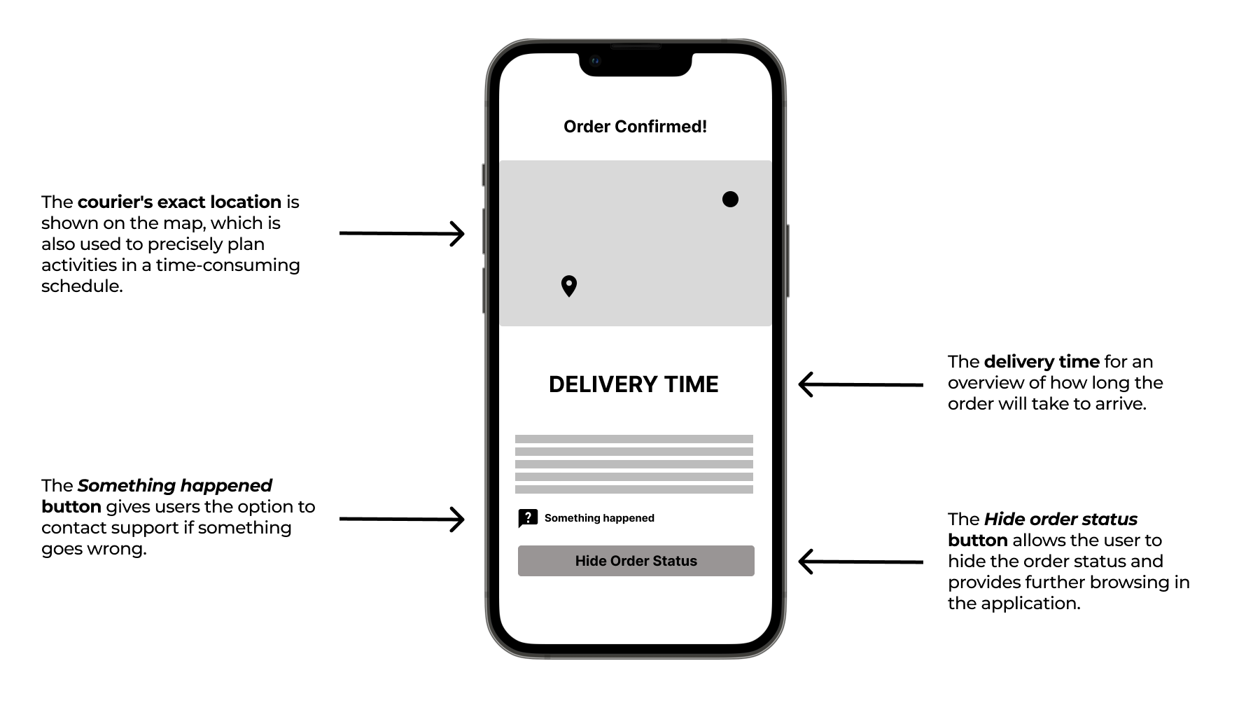
- Knowing the exact time when the food will arrive if you have a time-consuming job is useful for better planning.

Low-Fidelity Prototype
- Using the completed set of digital wireframes, I created a low-fidelity prototype. The primary user flow I connected was the registration process, browsing menu, choosing meals, checkout, delivery & payment confirmation, and rating process, so the prototype could be used in a usability study.

Usability Study: Findings
- I conducted two rounds of usability studies. Findings from the first study helped guide the designs from wireframes to mockups. The second study used a high-fidelity prototype and revealed what aspects of the mockups needed refining.
- No errors were discovered during both user testing that prevented users from completing the user flow.

Refining the Design
Mockups
- Early designs allowed some customization, and after usability studies, it was found that users did not have major issues limiting them from using the app. I edited the notifications badge number to be slightly bigger so it is easier to notice. I also added a search bar to help users find the notification they're looking for, such as the type of notification, a particular date or food, etc.


